Here are some of my tried-and-true favorite paint colors -- some of which I have used in multiple houses and would absolutely recommend.
Benjamin Moore St. Martin Sand ... warm taupe that looks gorgeous with black and white accents. This was also in the kitchen of my first house, with white cabinets, absolute black granite counters, stainless appliances, and warm terracotta tile floors.
Benjamin Moore Hasbrouck Brown (behind the shelves) ... perfect chocolate brown shade, not too warm, not too dark.
Benjamin Moore Bird's Egg ... so pretty and calming without being washed out. I'm using the color above it on the paint strip (Crystal Blue) for the ceilings in my new house.
Benjamin Moore August Morning ... a beautiful apricot color, but only use it in a sunny room! (I put it in a darker room in the next house, and it was pretty, but didn't glow like it does in a sunny spot.) This is probably my favorite room ever. It was the living room in my 90-year-old house in Birmingham. Love the color, the old floors, the woodwork, the stone fireplace.
Restoration Hardware Sea Green ... not green at all, but a lovely aqua. This was my bedroom in my last house. Chocolate brown and black really pop against this shade.
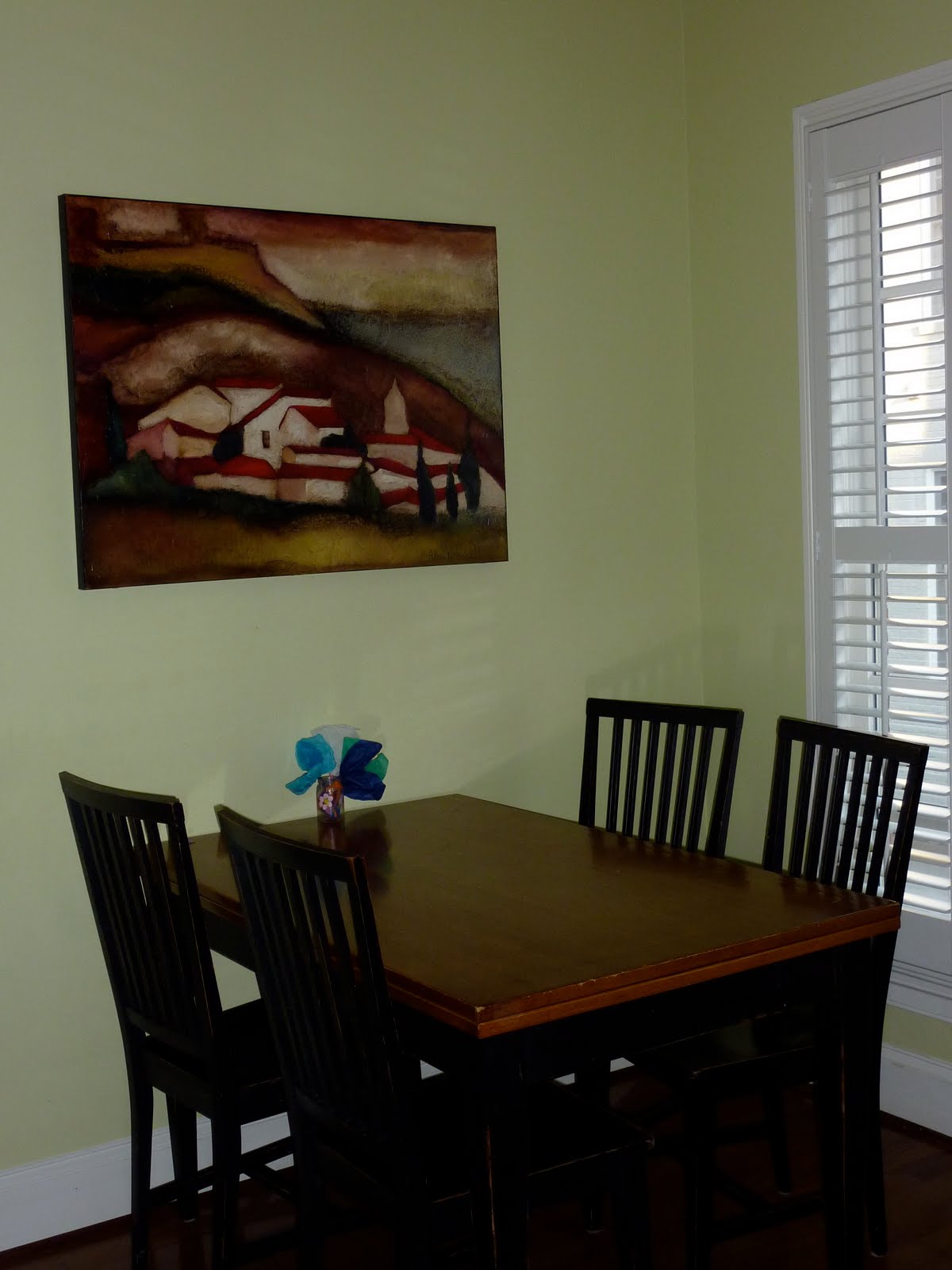
Benjamin Moore Pale Sea Mist (above and at left) ... used in three houses now, and I've never gotten tired of it. A lovely light green. May very well end up on my new kitchen's walls too!
Restoration Hardware Shore ... nice blue, not too "baby boy". It's not really my favorite, but exH picked it when this room was his office. It is lovely with the slate blue couch he has in there now.
Restoration Hardware Rose ... beautiful medium pink color; a perfect match to the Shabby Chic line at Target. This used to be Lulu's room before she decided to move in with Boo. I still love how it came out. You can't tell, but the slanted ceilings are painted RH Peony, a much paler version of Rose.
Benjamin Moore Jamaican Aqua ... love this color! It might be a little much for a large room, but I just adore it for a smaller bedroom or bathroom. So beachy and pretty.
Benjamin Moore White Sand... not my favorite choice, but we repainted with selling the house in mind, and it works very well for that. It's a warm off-white. (This is the room that I mistakenly tried to do in August Morning.)
Benjamin Moore Strawberry Sorbet on walls with
BM Stem Green in the closet. Yummy, delicious perfect pink. This was my daughter's first pink room (she's had three more since, the RH Rose above, BM Cat's Meow, below, and another BM pink I didn't like nearly as much as this one).
Benjamin Moore Yellow Lotus. It's bright -- way brighter than even this photos shows -- but I used it in a basement playroom that had no natural light and it was fun and cheerful.
As I mentioned above, this is my daughter's fourth (FOURTH) pink room! This one,
BM Cat's Meow, is a nice, slightly coral shade that gives it a twist. I think I still love Strawberry Sorbet the best, but this is a little more grown-up.


